How to create a signature visual aesthetic for your videos

 As you create more and more videos, you’ll likely find yourself choosing to use visual elements with common characteristics. It could be something subtle, like a color palette or font that represents you or your brand. Or something more obvious, like a motion graphic or a transition effect between shots. If used consistently, these elements will become familiar touchstones for your audience. Over time, your unique creative decisions will start to establish themselves as hallmarks of your signature visual aesthetic. And that will help your audience connect more deeply with your videos.

Defining and refining a unique visual aesthetic for your videos is super important for cementing your channel or brand in audiences’ minds. But did you know it also helps you create content more efficiently?

Tip 1: Visual aesthetics and efficiency go hand-in-hand

You have endless creative and stylistic choices when it comes to making videos. Different combinations of lighting, effects, and camera movements can all result in a completely different finished product. It’s easy to get overwhelmed by so many options. To combat this, Chrys suggests focusing on the things you like, and allowing your unique style to emerge organically

Identifying the visual elements you’re naturally drawn to is your first step on the path to establishing your signature visual aesthetic. Then, using those elements consistently across your videos is a surefire way to ensure your unique style will shine through. But that’s not the only benefit. Favoring certain aesthetic choices can also streamline your production process.

If you find yourself using specific lenses, lighting setups, or camera angles, take note of them for next time. This will reduce the number of production decisions you need to make every time. And that makes it a lot easier (and faster) to plan how and where you’ll set up your equipment.

Keep your lighting consistent for a recognizable visual aesthetic

Pay attention to how every shot is lit in your videos. This includes lighting color, intensity, and warmth. Different types of videos tend to favor different lighting setups, and each will create a distinct ambiance that the viewer will feel. 

Softer light, for instance, bathes the subject in a gentler, more flattering glow. You might use this more diffused lighting style if you make interview or testimonial videos with a lot of “talking head” shots. Hard light, on the other hand, is meant to stand out. It’s generally reserved for scenes where you want to heighten the mood, such as a harsh, concentrated ray of sunlight beaming through a window. Whatever kind of lighting you use, be sure it looks the same throughout your videos. 

A pro tip on how to use natural light: Windows are great, free light sources. You can easily alter the light from windows with sheer, textured, or patterned curtains to create different lighting effects.

Use the same camera and lens combinations throughout

You can use various cameras and lenses to give your videos dramatically different looks. Narrowing down your go-to camera/lens combos will not only give your videos a more recognizable aesthetic, it can also streamline your production process. 

When you go into a shoot knowing which angles, equipment, and lighting sources you’ll use, it reduces the number of production decisions you’ll have to make on the spot. That can save you precious time and mental energy (as well as some weight in your camera bag). 

Tip 2: Watch your assets

Creating videos requires a ton of decision-making, particularly around which assets to use. This can include everything from fonts and lower thirds to motion graphics and transition overlays. Chrys says it’s important to avoid getting bogged down by the avalanche of choices you have. 

We likes to keep his visual aesthetic simple. He only uses a single font and a handful of motion graphics and transition overlays in his videos. Some people incorrectly consider this a lazy approach. The truth is, these touches help make his videos stand out to his audience. That’s because they’ve come to recognize the consistent style cues he uses and has identified a bespoke combination of assets, angles, lighting, and gear that give his videos a signature look while streamlining his entire process.

Tip 3: Use color to your advantage when creating a visual aesthetic

The colors you choose to highlight in your videos can be a powerful visual differentiator, but selecting them can be time-consuming. Having a color palette in mind before you start shooting will drastically reduce the amount of time it takes to make your videos. One specific thing you’ll want to pay attention to is color temperature, which measures the “warmth” or “coolness” of your light sources. 

Soft, warm lighting is what you might want to capture if you’re shooting in restful settings like homes, restaurants, and hotels. For places like doctor’s offices, warehouses, and sports stadiums, harder, cooler lighting will usually help express the visual vibe you’re going for. Different light colors can make viewers feel a range of emotions, so don’t take that power for granted.

The time of day you film is another factor that affects the color in your videos. We prefers shooting during the day because it helps him achieve the warm tone he really likes. During the editing process, he simply copies and pastes his favorite color presets from his previous videos. Those presets speed up his process immensely, and ensure consistency across different projects. Every filmmaker is different, so shoot at the time of day that makes the most sense for the visual tone you want to capture in your videos. 

Using color consistently for branding and visual aesthetic

Color is a subtle but important branding signal, too. So, be sure to be consistent with color choices in your videos when considering your visual aesthetic, including any visual elements you incorporate.

As you work through your own creation process, pay attention to the colors that give your videos an aesthetic you love. Then, create your own presets so you can use them consistently from video to video. It will help solidify your signature look while also speeding up your production.

How To Learn Graphic Design Without Going To School

 Learn graphic design online for free, without going to school or without a degree. If you would like to become a graphic designer, you can do so for free or by taking affordable and free courses. I taught myself graphic design and have helped many others learn to become designers through this article. Keep reading — you got this!

So you want to learn graphic design for beginners? You’re in the right spot! I’m going to teach you how I became a freelance graphic designer with zero experience and without holding a degree in graphic design.

First, let me say that this article isn’t meant to undervalue those who do go to design school. Designers who spend years working on their craft are obviously very knowledgeable and do amazing work.

But sometimes school isn’t in the budget for everyone and you might want to learn graphic design on your own.

Figuring out how to learn graphic design is the hardest part, which is why I’ve written up all the steps I took for you to follow.

Now, let’s dive right into how to become a graphic designer!

Steps to Learn Graphic Design

Before you go any further, I want you to commit to yourself that you’re going to follow through with these steps (if it’s something you truly want to do)!

Step 1: Learn the Basics of Drawing

You don’t need to be a skilled drawer, but you will need to know some basics.

Before I began learning graphic design, I started with a good old pen and paper and went back to the basics.

I had to learn things like shadows and drawing 3D objects (something I wasn’t good at, but knew I would need to improve if I wanted to do logo design and mockups).

Step 2: Learn Graphic Design Theory

Your next step in learning graphic design is to learn some theory.

“But the theory is so boring.” I know, I know. Graphic design theory is rarely fun but I’m here to tell you how to become a graphic designer and the theory is super important.

If you want to become a graphic designer you’re going to need to learn some of the tedious material before jumping into the fun stuff.

Just because you are teaching yourself doesn’t mean you get to skip out on the boring material!

Knowing what types of fonts and colors go together and what doesn’t go together is going to help your designs immensely.

So teach yourself graphic design theory!

In regards to theory, I suggest starting off with learning the basics of color, typography, shape, space, lines, texture and size.

A great read to get you thinking of basic graphic design theory is the book Visual Grammar.

These books are some of my top picks for learning graphic design and design theory:

  • Design Elements: Color Fundamentals
  • The Language of Graphic Design

Step 3: Get Some Graphic Design Tools

As a bit of a digital nomad, my office moves around a lot so I like to keep it minimal when it comes to the tools I use. Luckily, graphic design doesn’t require lots of gadgets and gizmos (or oozits and whatzits #thelittlemermaid).

But the one thing you will need to become a graphic designer is graphic design software — this is non-negotiable 🙂

You can purchase Adobe Creative Cloud  which contains:

Illustrator: will be used for logos and other vector-based graphics

Photoshop: will be used to create special effects and edit media

InDesign: will be used to create materials for print or online such as brochures, PDF’s, books etc.

Plus many other programs that you can use as you grow!

Here’s where you may want to bookmark this article. Because when you are first learning how to become a graphic designer you aren’t going to need the below item, but after you’ve figured out the theory, how to draw and are comfortable in the above programs, you might find that you need some type of tablet.

Step 4: Learn the Tools of Graphic Design

Now that you have the tools and the know the foundation of graphic design, it’s time to actually learn the tools (yes! You finally made it to the step where you are going to actually learn how to become a graphic designer that can make designs)!

I’m thankful for all the affordable online courses out there because they will save you months of time trying to piece everything together on your own.

This Udemy graphic design course is much more affordable than an entire degree, yet it will still help you figure out how to use the tools and software.

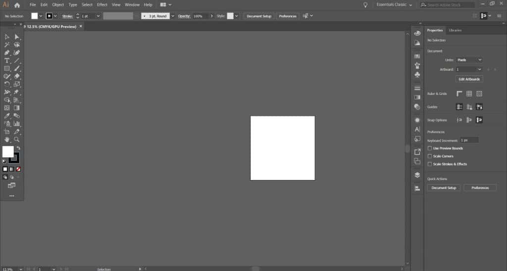
A screenshot of Adobe Illustrator's interface

If you want to learn graphic design, you obviously need to learn the tools, and having video instruction will make that process so much easier.

I highly recommend signing up for the above course if you want to fast-track things a bit.

After you’ve learned the basics, you’ll be able to use the tools to create your own designs.

Graphic Design Tutorials

You can also use YouTube tutorials to teach you everything if a course isn’t in the budget. YouTube is great because you can learn by doing, seeing and hearing.

Here are some of my favorite YouTube channels for free graphic design tutorials:

Spoon Graphics: My favorite tutorial was the Tattoo Inspired Vector Illustration in Adobe Illustrator. Prior to buying a tablet, I searched high and low for some quick way to create stipple shading. So bookmark this tutorial for when you are ready to stipple shade.

Design Tuts: There are some more advanced sports logo tutorials on this channel but it’s really helpful to see the process and how more advanced designs get formed.

Will Patteson: His channel is full of great information. Everything from tutorials to Q&A’s about freelancing. This is my go-to channel and helped me so much as a beginner.

Helen Bradley: This channel is my favorite for beginners. I came across Helen Bradley while searching how to make wreaths. Her tutorials are excellent for beginners.

PHLEARN: This channel is strictly Photoshop. Verbal instructions make the tutorials easy to follow. Some other channels (not PHLEARN) have tutorials that don’t have verbal instruction and only have music playing, which can be frustrating for a beginner.

Tasty Tuts: If you don’t want to read about graphic design theory, this channel offers video versions for you. I also learned InDesign by going through 15 InDesign lessons offered on this channel. Here is lesson one; the video description contains the other lessons.

Skill Share: Videos on a range of creative topics.

Matt Borchert:  This video on Matt’s channel discusses designer ethics and is a must-watch.

Graphic Tweakz: Logo tutorials galore!

Satori Graphics: Tons of tutorials.

These channels offer many different tutorials, but feel free to do your own searches to find what you are looking for and go through at least one every day.

Step 5: Build Up Your Graphic Design Portfolio

A lot of people are scared to venture out into doing real work.

“What if they ask for my credentials or my degree?!” Maybe you’re scared of this to? Let me tell you something — I’ve never been asked once in my career for my credentials.

I have, however, been asked to see past work or a portfolio, and when my prospects see my portfolio, they almost always book immediately.

So, where else can you find small projects to help develop your portfolio if you want to become a graphic designer?

First Canva Project

 You’ve got the vision, and Canva is here to bring it to life. Turn imagination into a finished design in minutes with this step-by-step tutorial for designing from scratch in Canva.

Canva’s templates provide a shortcut to good design: they’re fully customizable, so you can change the colors, images and more to suit your taste. We’ve got tens of thousands of templates for every design need.

But sometimes you need something completely custom-made. How do you ensure what you create actually looks good?

In this article, you will learn:

How to create a design from scratch using Canva

Quick tips to make your designs look good

How to choose the dimensions for your design

How to create a background for your design

How to add text, images and more

Design tip: Sketching a rough outline of your design on paper before you begin can help you bring your vision to life. It doesn’t need to be perfect. Consider what you’d like to include in the design, and where it might look best.

Ready? Let’s get started.

01. Choose the right dimensions for your design

To begin, choose your design type from the Canva homepage. These are set to the optimal dimensions for each graphic, whether it’s a social media post, flyer or more. Or you can use custom dimensions by searching for “custom size”. You can choose from pixels, millimeters or inches.

02. Choose a background

The background for your design could be a color, or an image.

Background colors

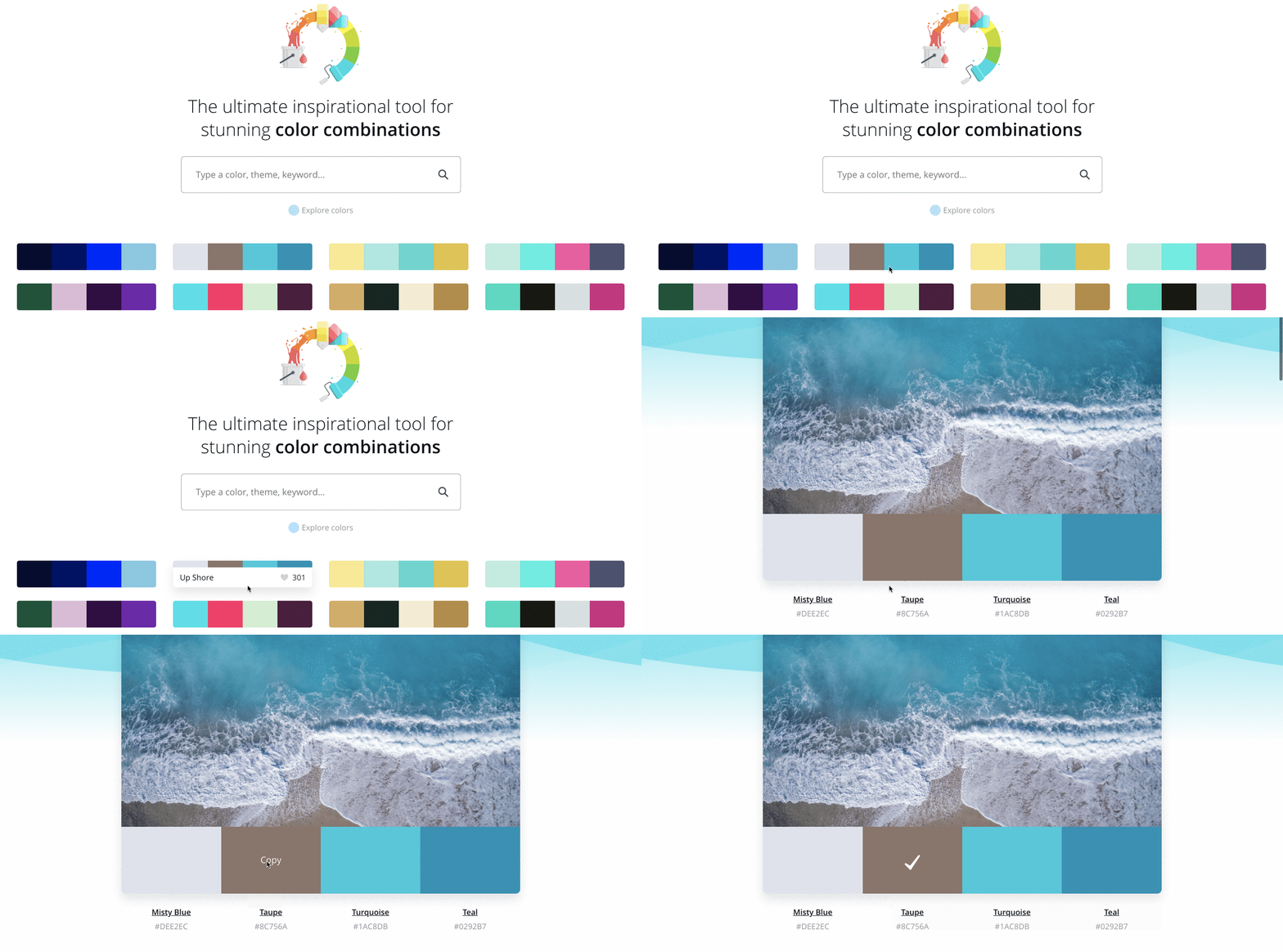
Design tip: Different colors tell different stories. Purple is associated with individuality, orange relates to activity, and green conjures images of nature. Think about what colors best suit your needs. Find a good color combination with our color palette tool.

Of course, you can always use a white background too.

To choose a color, use the Color Picker tool in the toolbar at the top of the editor.

Background photos

To use a photo as a background, first add a grid. Once placed on a grid, photos can be resized, cropped, flipped and layered to create a variety of visual effects.

Next, search Images or upload your own. Then drag and drop your image onto the grid: it will snap to fit.

You can add filters to change the brightness, saturation and clarity of the photo. This can help when layering text and elements.

Design tip: You can add background images or feature images to your design.

A background image supports the message of the content. If there’s too much going on in the background, it’s hard to overlay things like text or illustrations. When you are choosing a background image for your design, consider texture over structure. You can crop images to find pockets of texture that will work better—this way you can also remove any space or features in the image that creates too much noise.

The image below uses a close up photograph of a rose to add textural interest to the design, but its main role is to act as a vehicle for the text.

A feature image becomes the focus of your design: this image sits high in the order of visual hierarchy. Use a single, or split-cell grid to apply clever feature images and help your content sing.

3. Add your elements

Your design might include text, icons, photos or illustrations. These need to be combined in a way that is visually appealing.

Canva graphic designer Lynneal Santos says it’s a matter of balance. “Consider the balance and composition of all the elements in the design. When you’re laying out your elements, ask are the elements balanced? Are they centered? And ensure they’re not too close to other elements or the edge of the page.”

Her number one tip? “Keep it simple.” Don’t overload your design with too many elements, as it can confuse the visual message of the image. This is something designers call visual hierarchy, which involves the arrangement of elements according to their importance. Try playing with size, color, and placement in order to see what works best.

If you want to add a photo to your design, try using one of Canva’s frames. You can find these under “elements” in the side panel.

Design Tip: Harness the power of negative space. Negative space, also known as white space can be any area within a design that is free from text, images, or embellishments (it doesn’t have to actually be white). Designers love it because it can help create grouping, add emphasis and improve legibility.

4. Choose the right fonts

The look of your fonts can have a huge impact on your design. Take a look at this playful typeface: perfect for a fun beauty brand. Not ideal for a law firm.

Choosing one font is hard enough. But your design may need more than one typeface. Canva suggests never using more than two fonts in a design, as too many fonts tends to make a design look “messy”. You’ll want to choose complementary fonts, which add visual interest while working well together. You can learn more about which fonts look good together with tips on font pairing.

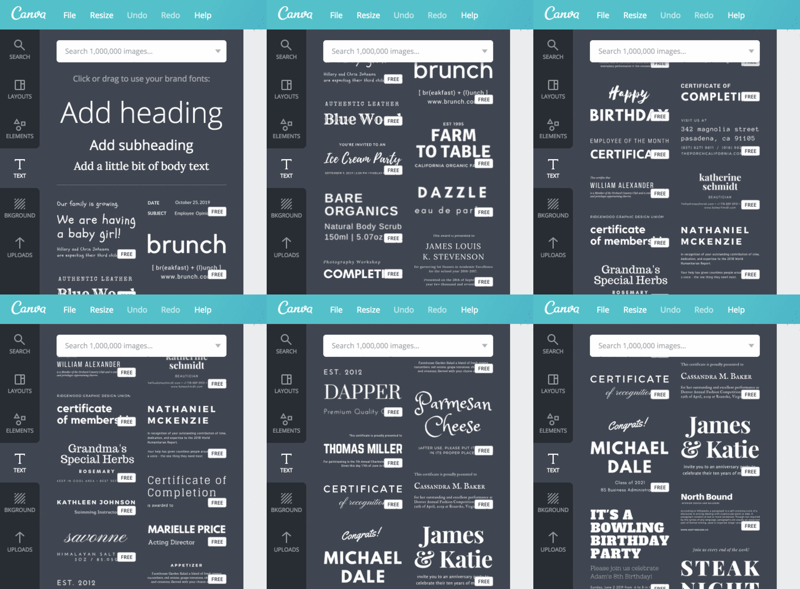
Canva Text Tab

Canva has hundreds of pre-set font combinations to choose from. You can find these in the Text tab in the side panel.

Or you can create your own combination. Again, simple is best: if you’re choosing an elaborate font, ensure you pair it with a simpler font so your design is balanced. Canva’s Font Combination tool can help, and Traditional combinations like a sans serif font and a serif font can be very powerful.

Don’t forget about readability. If your fonts are too complicated, they can detract from your message.

Design tip: Typographic hierarchy establishes the order of importance given to different design elements. By applying different fonts, color and scale to your text, you can dramatically change the way your message is received.

You don’t have to study for hundreds of hours to be good at design. But, like most things in life, you’ll get better with practice, so don’t be disheartened if your first design doesn’t turn out perfectly. Instead, keep practicing and keep creating. You’ll be creating brilliant, polished images in no time.