Theme your Instagram

 Instagram is by far my favorite social media and what I enjoy most about social media marketing for our blog. It took me some time to establish a bit of know-how when it came to an Instagram strategy and building up a large audience, and part of that know-how was understanding how to visually theme and balance my feed.

An Instagram theme is a cohesive pattern of images, colors, and content that is visually appealing in a grid on your Instagram profile. You’ve probably seen them on some of your favorite Instagram accounts.

Why is an Instagram theme important?

Your visual content on Instagram is what Instagram users see first and we all know that first impressions mean a lot. It takes just a few seconds for anyone to make a judgment about you and your brand. So, having a cohesive theme on your Instagram grid will help to keep new users on your profile and engaged in your content.

When creating your first Instagram theme, it’s good to think in terms of 9 individual posts grouped together. When you look through Instagram profiles, the first top 9 posts are what is seen grouped together first. So, this makes your top 9 and most recent posts important for first impressions.

1. Know and Use Your Brand Colors

When it comes to a flawless looking Instagram grid, there is something you may or may not have noticed. The colors go well together and are part of the brand’s color scheme.

For beginner’s who aren’t graphic designers, creating a color scheme can seem like a daunting task. Besides hiring a designer to help you out, the best trick I’ve got to share with you is to simply pick a photo that you want to use in your branding and run it through a photo color generator. Inside the adobe color scheme generator, you can upload an image and it will generate a color scheme for you.

2. Decide on a few image and graphics parameters

When establishing your Instagram theme, color is important, but so is the quality of your visual content. Having set parameters around the types of photos you share will help guide you so you don’t share that last photo you took of your sushi dinner last night in that poorly lit restaurant.

Some example parameters might be:

Photos shared on my Instagram must be bright, white, and can be very colorful

I will always plan my grid in a puzzle them .

Some Photos shared can include some flat lays and product photos. But only with white backgrounds.

All Photos are well lit and only shared after they are edited to perfection first.

Graphics are allowed, but the font used must be “Raleway” and 12px in a dark grey color, on a blue or a pink background.

You get the idea. Sit down and figure out some parameters to the Instagram grid you want to create and stick to it.

The complexity of image options and choices is partially why some people do decide to try creating a theme with a Puzzle grid. If you’re curious but don’t want to start a puzzle grid from scratch? I figured you might need a starting point. So, you can go ahead and grab this free puzzle template made for you in Canva .

3. Know where and how you will get your images

 I know that there is a need for bloggers to outsource their photography. But, stock photography or custom photography might not be an option or you may enjoy photography yourself. Either way, a huge part of creating a visual content strategy for Instagram is the photos.

If you plan to take photos, grab free photos, create graphics, or hire someone to create photos or graphics for you, go ahead and batch at least 30+ photos or graphics at once. Here are my best tips for sourcing and collecting as many photos and graphics as you can.

Get free stock photos from our giant library

Get custom photography made

Join a stock photography membership, where we add 100+ new photos every month

Take photos of your own, even your cell phone will do – here’s how

Learn how to take your own flatlays

When taking your own photos, make a long list of ideas for props or locations, like this one we created

4. Understand that you should likely mix up your content types

 When establishing what kind of theme to have, it’s good to have some sort of pattern in mind. This can be a color pattern or a pattern created based upon the type of content seen within the Instagram posts, which I like to call “content buckets”.

Content buckets are similar to the types of content you might have on your blog under your menu of categories but should be treated as micro versions. You can format your pattern any way you like. The key here is establishing a strategy, a pleasing visual grid, and a plan to help you know what to post next instead of posting on a whim when it might not look good or feel right in your existing grid.

5. Understand balance (Color, Space, Focus)

COLOR: As we’ve been discussing, the use of your brand colors is important for creating a cohesive experience between all of your platforms. Color balance is simply the balance of colors you use within your feed. So, if you have 4 colors in your brand color scheme, you could use a ratio of 25% for each, or 100% of your main color, or some other variation. You can also change up the ratio of color balance throughout your grid, which you may see in my Instagram. But, remember that when you create this balance, think in groups of 9 so that when someone is scrolling through their feed, they can clearly see the theme and some cohesion.

FOCUS & SPACE: When it comes to balancing, you may also want to consider the types of things you are capturing and sharing, how close they are to the lens when photographed, and how much white space/negative space they may or may not have around them. There’s no right or wrong to this, but remember to look at this ahead of time and ask yourself “does this fit in with the other images I post?”

Some accounts only share one type of content – while others share a variation. It’s good to know what your plan is going to be so you can plan around that and balance it.

If you plan to share the same type of image on Instagram every time, remember to make sure the colors work together and that the scale and zoom are the same.

If you plan to share a variation of photos, it’s a good idea to share them in equal proportion. So, don’t share 4 flatlays in a row and then 2 selfies. This won’t feel balanced. Instead, if you plan to share selfies and flatlays, consider doing a selfie every other or every 2 flat lays.

Creating this ratio and balance will help with a cohesive and balanced theme.

6. Set up a pre-made map and scheme in PLANN

I use an app called PLANN to schedule my Instagram posts ahead of time. It helps me layout my photos in an aesthetically pleasing way, pre-input my captions, and hashtags and set a time of day to post. This eliminates the need to stop what I am doing every day to post something new.

However, you can do this anywhere. I suggest making a “map” in your favorite graphic design software and making some templates with information about your schedule.

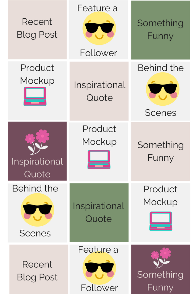
Here’s a Premade 7-Day Example list of Instagram Content:

Besides the above example, here’s another sample of a pre-made “plan” you can use as a visual map for what type of content to post next:

Day 1 = Behind the scenes

Day 2 = White background, black text Inspirational Quote

Day 3 =  Repost a photo from my community

Day 4 = Latest Blog Post

Day 5 = Behind the Scenes

Day 6 = White background, black text Inspirational Quote

Day 7 =  Repost a photo from my community

If you accidentally post something that doesn’t look good within your theme, or maybe you post it at the wrong time of day and it isn’t getting the engagement you had hoped, it’s okay to delete it and maybe try again another day. Don’t be afraid to delete posts that do not look good and have not performed well for you.

A great place to start when it comes to setting up a great looking Instagram grid on an existing account is by getting those bad posts off of your account.

Product Photography Ideas

 When it comes to selling your products on social media or your eCommerce store, the way your products look matters far more than you think. We live in a world where people do judge a book by its cover or product reviews. Forbes found that 88% of shoppers characterize detailed product content as being extremely important to their purchasing decisions.

Your product photos can help to increase your sales, or it can stop them from happening. Here are some statistics you should consider before you publish your next photo photography:

  • We found that 22% of returns occur because the product looks different in person
  • Buffer found that good visual content is 40% more likely to get shared on your social accounts
  • 75% of online shoppers rely on product photos when deciding on a potential purchase.

Not to mention your customers are used to being bombarded with high-quality content on such a regular basis that they now expect all brands to do the same, and to fall short would only give the impression that your product lacks quality.

Instead of taking the chance to have your content overlooked, let’s make your content irresistible with these 8 product photography ideas.

1. Product Photography Idea: Use a White or Black Background

This is a classic product photography tip that most eCommerce stores based on their product images. Using a simple white or black background to give your customers a proper view of your product helps to eliminate any misconceptions.

A product photo’s quality reflects your brand image, creating the infamous first impression, so it should easily highlight your product’s best features. Based on the product’s color, you can decide whether you should use a white or black background, but it should be complimenting.

Pro Tip: Test and experiment with the right lighting regardless of whatever color your background might be. When you’re taking product images with solid backgrounds, be sure to check your lighting, too light, and the image might be blurry and too dark, and customers might not see essential details.

Try to stay away from background colors that look unappealing or too distracting. Remember, at the end of the day, the product is the focus.

2. Product Photography Idea: Take a Product Detail or Texture Shot

During early 2019 a common trend started to appear with skincare and food brands, close-up product shots showing off the textures, colors, and touch of the product. Brands do this because it works. It gives a truthful yet fun look at what customers can expect in your packaging before purchasing.

Nearly one quarter of product returns are because of inaccurate depictions of the product.

Yes, high-resolution photos allow customers to zoom in and examine the product with a fine-tooth comb. But they don’t show customers what type of texture, how it might feel or what they should actually expect it to look like in person.

Pro Tip: When doing texture or detailed product shots, you want your images to be as realistic but eye-catching; it’s not just about showing what’s in the jar or features of the product but displaying them as pleasing as possible.

3. Product Photography Idea: Take a Flatlay Shoot

Flatlays have entirely taken over every visual social media app. And rightfully so, people love a good flat lay. As staged as they are, people love them because it gives them an idea of what the product would look like laying in their own home, closet, or table. It’s relatable and natural.

Most flay lays shot from an above angle shot to help show off all the props and products.

When you’re creating a flat lay, you should have a set background, location, or props.

Try not to add too many products to your flat lay; instead, leave a little space between them. Create balance in your photo by mixing smaller objects with larger objects and placing objects of similar colors on both sides of the image.

Pro Tip: Keep in mind the dimensions of the picture when you’re taking your image. You don’t want to cut off too much of your flat lay. Whatever you’re going for, keep your theme in mind while selecting your props with a cohesive look.

4. Product Photography Idea: Create a Lifestyle Shot

 83% of online buyers consider images the most influential factor in their purchase decision.

When you take lifestyle shots, you allow customers to see your products in action. Instead of wondering what it would be like to own it, you share the experience right there and then.

Pro Tip: When you’re doing lifestyle shots, you can either surround your product with commonly used items or have a model pose with your product in action. Try to use places that your customers are most likely to use your products and capitalize on them.

5. Product Photography Idea: Use Props

Adding props to your product photography can help to add some creativity to your final look. These props could be flowers, everyday objects, or fabric. These props should help to enhance the visual experience and ensure that your work stands out no matter where it’s placed.

When you’ve found the perfect prop(s) you should play around with unique placement to help pull the whole photo together. There’s no hard and fast rule for using props. Just don’t put your prop where it logically makes sense for it to go.

Pro Tip: Sometimes less is more, it can be tempting to buy and use a lot of props, but this can make your product photo look crowded and distract viewers from what they should really be focused on, your product.

6. Product Photography Idea: Take Shots from Interesting Angles

You don’t always have to take your product photography straight on or above. You take product images from an angle. Different angles allow you to show off various dimensions your product may have. It can show just how tall, short, thin, or large your product is once the consumer has it in their home.

7. Product Photography Idea: Take Shots of Your Product in Use

Another fantastic product photography idea you can try is to take shots of your products in use. This could be content created by an influencer or with the help of models.

This type of product photography is especially great for fitness or products that your customers need to use actively.

When you’re taking active product photography, you should ensure that your photo’s timeliness is important as well.

Timeliness is when you retain the meaning and relevance of a photo that it has today many, many years into the future.

8. Product Photography Idea: Use Creative Photoshop Techniques

Remember, you don’t have to use a plain white background forever product image. For social media and branding on your website, you can get a little more creative by photoshopping your product photo’s background.

This would mean that you’d either need to hire a professional graphic designer or learn some photoshop tricks on your own. I suggest hiring a professional.

Product Photography Tips

Whether you’re doing these product photos yourself or hiring a professional, you’ll still need to have a few things on hand to ensure that you’re always prepared to take the perfect photo for your brand.

Here is a list of product photography tips and tools you should know:

  • Get a Tripod: A tripod should always be on hand. This can be used for a camera or phone so that you can get that steady shot. It also helps to get precise angles and take photos while working on a one-person team.
  • Invest in Proper Lighting: Lightening is so essential to your product photos. It’s always better to have a ring light or softbox on hand so you can control the lighting of your photos rather than being at the mercy of your room’s lightbulb or the sun.
  • Invest in Backdrops and Props: Go on sites like Amazon or even your local craft store to gather a collection of props and backgrounds. You might not need to use them right away, but it’s better to have options when you want rather than have none when you need them.
  • Use Editing Apps or Software: Invest in editing apps that can help to make your photos look more professional or edited. This could be simply adding a filter, or it could mean resizing, sharpening, and enlarging your product photo.
  • Create an Inspo Folder: Create a folder and save all your favorite product photography that can help to inspire your next shoot. You can use this to guide you when you’re doing it on your own or as Inspo for your photographer so they know what kind of photos you’d like to have at the end of the shoot.

Product Photography Recap

It may seem a bit overwhelming, but product photography is a skill like anything in business. Once you start practicing it.

Invest in the proper equipment, whether it means a better phone or DSLR camera it’s an investment that’s sure to pay off. Here’s a quick recap of the eight best product photography idea:

  • Use a White or Black Background
  • Take a Product Detail or Texture Shot
  • Take a Flatlay Shoot
  • Use Props
  • Create a Lifestyle Shot
  • Take Shots from Interesting Angles
  • Take Shots of Your Product in Use
  • Use Creative Photoshop Techniques